Pages

Sunday, March 31, 2013

Moxie Fab - Chevron Challenge

Hello again!

Don't you just love a long weekend?  I know I do!  I was so glad to have the time to work on some challenges over at Moxie Fab World.  This is the first one I attempted - The Chevron Challenge.  I don't usually have time to work on card challenges, but I'm going to be making more time in the future. This was fun, and it makes me stretch my creativity.

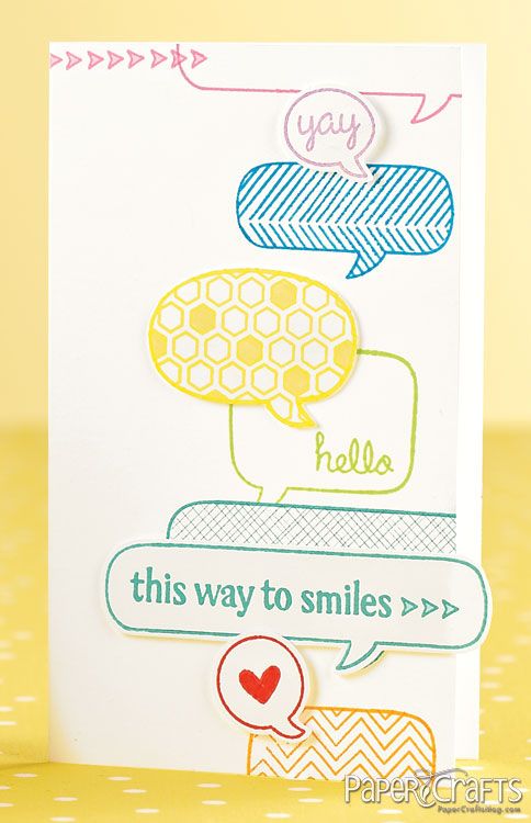
Here is the sample to get us started:
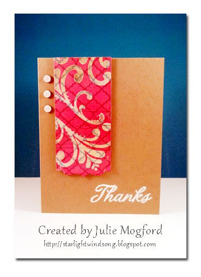


This is my version!


I'm still working on trying to use products that are already on my desk, and the only thing that was out of reach was the ribbon, but that's only because I keep it on a shelf next to my work space :)

The chevron pattern was a pretty one I had been hoarding, and now was as good of a time as any to cut a piece and use it.  I also found a Crate Paper tag that was in the same muted tones as the chevrons and I thought it would be a good fit.  I used another Thank You stamp from Hero Arts.  I cut it in half and stacked the sentiment to fit the tag a little better.

This is when I got stuck - I just didn't know where to go from here and it was a bit "flat" and needed some items to set the paper off from the card base (which was going to be white, but I switched to kraft) and be flattering with the colors in the pattern paper.


I found that I also had a sticker border sheet that was the same line as the tag I had cut, and I added this detail to the bottom, bringing out the aqua lettering.  To set off the pattern paper from the base, I added a chocolate brown cardstock from my stash.  I added the vanilla ribbon to this layer and added the tag to the ribbon.  I heard this tip from Julie Ebersole I think - instead of threading the ribbon through the tag, I snipped the tag at the top through to the hole and then attached it to the ribbon. I love how this works and I don't have to fight with the tag when tying the ribbon.  The slit is hidden under the ribbon and I used foam tape to lift it off the card and keep it in place. For some last details, I found some tiny pearls to add to the sticker border on the tag, and a Prima flower in a shade that perfectly matched the pink coral in the chevron.


Tips to remember:
1. Step away and come back to look at the card with fresh eyes.
2. Cut a slit to slip tag over ribbon after it is tied.
3. Don't be afraid to cut a stamp to make it fit your needs.


This was my first challenge in quite awhile. I liked being able to push myself more to create an even better card.  This hoarded stash of mine is definitely coming in handy.  Check my other Moxie Fab Challenge post for the Speech Bubble Challenge here.


Thanks for stopping by!
Julie


Supplies
Stamps: Thank You, Hero Arts
Ink: Stazon Timber Brown, Tsukineko
Paper:  Wayfarer "Knockabout", Bazzill; Crumb Cake, Stampin' Up!; brown cardstock from stash.
Embellishments:  "Pretty Party" tag and border stickers, Crate Paper; pearls (stash); Flower, Prima; Vanilla Taffeta Ribbon, Stampin' Up!.
Other: foam adhesive, Stampin' Up!; Cropadile, We R Memory Keepers.

Moxie Fab - Speech Bubble challenge

Hello again!

I've got another Moxie Fab World Challenge creation to share.  This one is for the Speech Bubble challenge.  Take a look at this challenge sample.


This is my take:


My challenge was that I needed to make a card with a speech bubble, but I had no speech bubble stamps or dies.  Never fear!  I found a really cute design set on the Silhouette store from Sarah Hurley and cut it on my Cameo. I was able to resize the bubble to fit with both the bird and the size of the card - gotta love that about the Silhouette!  For the sentiment I chose some alphabet stickers from Basic Grey and added the "hey there" with the same pen. 

 
OK, let me just say that I LOVE THIS BIRD!!! I do!! I can't believe I've only used it one other time. He is just so cute! I stamped the bird with Memento ink and colored him using Prismacolor pencils.  I went back over his eyes with a Faber Castell Pitt Artist Pen.  It worked great over the top of these waxy pencils. I couldn't help myself so I added some yellow stickles to make him even more fabulous!  Too Fun!


I think he's pretty cute, and totally great for a Spring "Hello" card.  Hope you enjoyed this one as much as I did and I hope you are enjoying the Spring weather as much as I am. And, if you like challenges, check out my post of my other Moxie Fab challenge creation for Chevrons.


Thanks for stopping by!

Julie


Supplies
Stamps: Dorky Bird  O-75 by Judith
Ink: Espresso Truffle Memento, Tsukineko
Cardstock: Crumb Cake, Stampin' Up! and white cardstock from stash
Embellishments: Picadilly Alpha Stickers, Basic Grey; Silhouette speech bubble die cut, Sarah Hurley.
Other: Pitt Pen, Faber Castell; Color Pencils, Prismacolor.

More Pattern Paper

Hi everyone!

Today I am sharing my creation for Day 2 of Online Card Classes: Pattern Play.


I decided to do the ink resist technique on pattern paper.  This is another technique I like to do, but don't remember to do it that often.  I had one of those moments where I wasn't sure what I wanted to use, but started using things that were already on my desk.  {Thanks Shay!}
 
 
I started with the "oh so cute" pattern paper from Studio Calico and die cut it with a die from the Half and Half collection from Papertrey Ink.  When deciding on a stamp to use, I couldn't "resist" picking one of the cute flourishes from Flourish Fun 1 that I designed for Paper Wings Productions. I inked it with VersaMark and stamped it repeatedly over the strip of paper and embossed it with clear embossing powder.  Using an ink blending tool I added Worn Lipstick ink from Ranger/Tim Holtz until the background was sufficiently colored and revealing the embossed image.


I needed just a few more details, so I stamped a Thanks sentiment and embossed it in white EP and I had these left over punctuation marks from my Thickers and decided to use them as an embellishment instead of gems.  Definitely a different look, but I like it.


After this long absence, I think I'm finding my crafting voice again and it is such a good feeling.

Supplies
Stamps: Flourish Fun 1 by Paper Wings Productions, Thanks from Hero Arts
Ink: Versamark Ink by Tsukineko, Worn Lipstick Distress Ink by Tim Holtz / Ranger
Paper: Studio Calico "Take Note"
Other: Half and Half die collection from Papertrey Ink, Stampin' Up! embossing powder in Whisper White and Crystal Clear, Thickers by American Crafts from my stash


Thanks for stopping by!

Julie

Tuesday, March 26, 2013

Playing with Patterned Paper

Hello all!

I have a little card to share with you.  I just participated in one of the great classes over at Online Card Classes  called Pattern Play.


I was inspired to create this card from a layout that was demonstrated by Amber Kemp-Gerstel. Here is my version.


There are so many things I like about this card.  The panel with a window is something I have tried before, but this version is a bit different, especially with including the border strip.  Everything is up on foam adhesive, and I love how that accentuates the elements.


I challenged myself to use a pattern that I wouldn't normally go to.  I liked this floral, but had passed it over several times before. The green and white polka makes a good border and I looked for something to use as the central element.  I remembered I had all of my Jenni Bowlin butterfly stickers (can you believe it?) and they just happen to be the same shade of yellow as the flowers in the paper and the pattern is subtle, and almost reads as a solid. The addition of the sentiment with Barn Door red ink completed the look.  I like that it is fun, and its also a clean look.


I made this card for my Aunt Carla for her birthday and I think these colors remind me of her.  I hope she likes it!  I was amazed at how out of practice I was in making cards.  It seemed to take me forever, mainly because I look through all of my papers and embellishments.  My hoarding came in handy but also slowed my pace.  I do know this - I had fun getting back into my craft space and spending some time doing something that gives me so much enjoyment. 


Card supplies
Stamps: Hero Arts "Birthday Wishes"
Ink: Tim Holtz Distress Ink - Barn Door
Paper: Pebbles - Seen & Noted
Other: Jenni Bowlin Butterfly, Circle Nestabilities by Spellbinders
 
That's all for today.  Thanks for stopping by!
 
Julie
 

Sunday, March 17, 2013

One Little Word 2013

Hello everyone!

I'm back from an extended blog break and ready to get back to sharing my creative journey.  Today I am going to share my One Little Word project for 2013.  I first joined the OLW project in 2011 but needed to take a break from it in 2012.  I really missed the process, so I am back again and having fun working on the project.  I like the introspective nature of this class.  My word for this year is BRIGHT! 

Our January prompt was to create an intention for each month of the year.  I also added a few decorative cards, and some cards that we used back in 2011 where I give the definition of my word, and the synonyms that I feel apply to me. Here are a few pictures of my cards.


 I took a lot of time to write out my intentions - probably was overthinking it, but wanted it to fit my needs and also work on some items that I tend to neglect.  Each card has a digital version of my handwritten "bright" and after they were printed I added glitter glue in the coordinating colors.  The photo on the bottom right hand side was the inspiration for the color pallette.  Here are a few close ups of the extra cards.


This paper is actually from the Becky Higgins Clementine digital collection and I changed the color a little to fit my needs.  I added these thickers to spell bright.  I love how this card came out. (there is a bit of a glitter theme.....insert smiley face here :)  )


On my definition card, I also used another one of the Clementine Papers to make a border and then added glitter after it had printed.


Color inspiration photo - found on pinterest from Better Homes and Gardens.


I love this paper by Linda Roos (In the Making Designs) from her line Retro Mango.  I added more glitter glue to the dots to give them some sparkle and punched a simple star on white paper and used a pop dot for a little dimension.
 
 
My synonyms are on paper from the Right Round collection by Queen of Quirk. I like the subtle background design on this paper, giving it interest without competing with the words.


I added a photo of me in a poloroid style and added a few stickers from Simple Stories Snap Life.  I like working on these little cards - too fun.
 
 
The February prompt was to create a vision board.  I thought about working on it with magazine photos, scrapbooking supplies and possibly put it on a canvas, but I decided to work on this in picasa and make it a collage and add quotes for added meaning.  I LOVE how this turned out!!! Many of the pictures I found either on the web or while looking through my pinterest boards.  The green tag that says "smile every day" is one of my creations.  You can see the original on this post.


It's good to be back blogging again.  Thanks for stopping by and hope you come back soon!
 
 
Until then...
Julie